Description
Visual Feedback Creator makes it possible to combine multiple modules into fully interactive, responsive exercises. While similar in functionality to the Advanced Connector module, Visual Feedback Connector provides a user-friendly graphic interface, making it much easier to work with for those with no previous experience in writing scripts.
Properties
The list starts with the common properties, learn more about them by visiting the Modules description section. The other available properties are described below.
| Property name |
Description |
| Scripts |
List of scripts to be executed when specified conditions occur |
| Is Disabled |
This property allows to disable the Visual Feedback Creator module so that it doesn't react (evaluate any scripts) when new events hit Event Bus. |
Scripts
Majority of scripts consist of at least 4 blocks, sequentially connected together.
- Source module block - specifies the module sending the event. In cases where Source Event block is used, this block is ommited.
- Event block - specifies the conditions that the event must meet in order to trigger the action to occur.
- Feedback module block - specifies the module performing the command.
- Action block - specifies the command to be called on the feedback module.
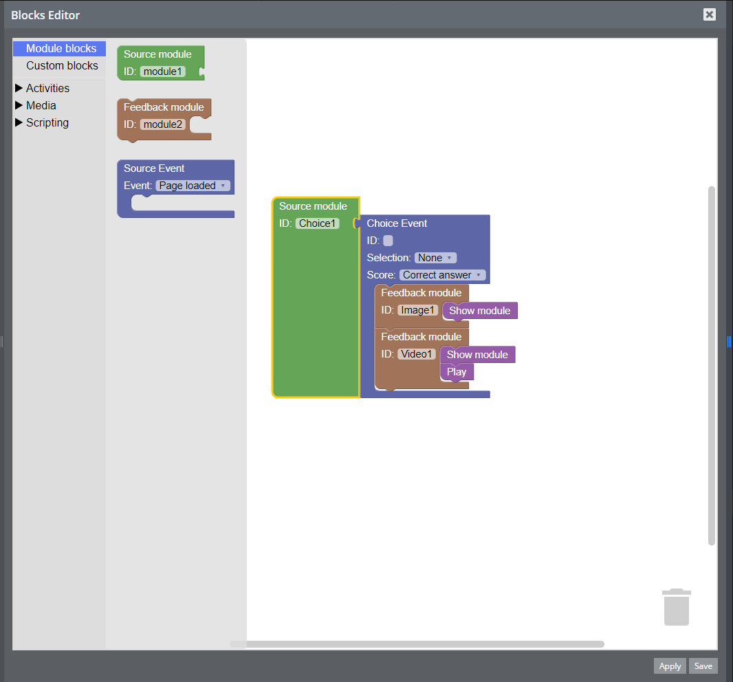
Each Event block can have multiple Feedback module blocks attached to it, and each feedback module can have multiple Action modules attached to it. Actions are performed in order from top to bottom.
An example script is shown below.

This script will be executed when a correct answer has been selected in the Choice addon with ID "Choice1". Once that happens, modules 'Image1' and 'Video1' will become visible. In addition, 'Video1' will begin playing it's content.
Supported Addons
Presently, following addons are supported by the Visual Feedback Creator:
- Audio
- Choice
- Connection
- Feedback
- Image
- Ordering
- Text
- True False
- Video
The blocks provided for the supported addons are based on their available commands and events. You will find more information about them in the documentation of each individual addon. Unsupported addons can still be used, thanks to the blocks in the Custom blocks category.
Module blocks
| Block name |
Description |
| Source module |
Specifies the module sending the event
| Field name |
Description |
| ID |
module's ID |
|
| Feeback module |
Specifies which module will perform a specific command once the event is triggered
| Field name |
Description |
| ID |
module's ID |
|
| Source event |
Specifies the event that will, trigger a command, in cases where such event is not being sent by a module.
| Field name |
Description |
| Event |
Dropdown list of supported events: Page Loaded, Reset, Show Answers, Hide Answers, Check, Uncheck |
|
Custom blocks
In cases where a specific addon is not yet supported by the Visual Feedback Creator, or greater control over the triggering event is desired, the user may use custom blocks to still access the functionality they need.
| Block name |
Description |
| Custom action |
Allows the user to call any command available for the feedback module, using the same syntax as the one used by the Advanced Connector.
| Field name |
Description |
| Script |
The call to the feedback module's command. For example, while trying to call 'Image1.hide();', this field should contain value 'hide()' |
|
| Custom event |
Allows for exactly defining any event that is to be triggered. If any of this blocks fields is left empty (with the exception of the field 'Event'), it will not be used.
| Field name |
Description |
| Event |
Dropdown list of available event types: Value Changed, Page Loaded, Reset, Show Answers, Hide Answers, Check, Uncheck. |
| Item |
'item' field value of event data |
| Value |
'value' field value of event data |
| Score |
'score' field value of event data |
| Type |
'type' field value of event data |
| Word |
'word' field value of event data |
|
Supported commands
| Command name |
Params |
Description |
| --- |
--- |
--- |
CSS classes
| Class name |
Description |
| --- |
--- |

